The average regional city resident lacks good access to two-thirds of community services, and liveability suffers
Melanie Davern,RMIT University;Alan Both,RMIT University;Carl Higgs,RMIT University, andLucy Gunn,RMIT University
The way our growing cities are planned and built is becoming ever more important in building healthy, liveable and sustainable communities. Much of the focus on liveability has been on Australia’s biggest capital cities, Sydney and Melbourne, which will become megacities of more than 10 million people by 2050. Regional cities are often missing from these conversations, but will be critical for future liveability and sustainable urban development across Australia.
In research for the newly launched Australian Urban Observatory we found people living in urban neighbourhoods of regional cities have satisfactory access to only 31% (five of 16) of essential community services on average. Capital city neighbourhoods have access to 40% on average. This means residents of many parts of both regional and capital cities need more accessible services.
These findings are drawn from Liveability Report scorecards for eight capitals and 13 regional cities, which are now available online.
Good access to community services is a key element of liveability.
We developed the Australian Urban Observatory to make understanding and measuring liveability easier. It’s an online digital platform providing liveability indicators across the nation’s 21 largest cities. (The smallest of these has 80,000 residents.) Together, these cities are home to nearly 20 million people.
The eight capital cities have 67% of Australia’s population. The remaining 13 cities are home to about 13% of Australians.
Many of these regional cities are predicted to grow substantially over the next 30 years. Some are already among our fastest-growing urban areas. These regional cities are Albury-Wodonga, Newcastle-Maitland, Wollongong, Cairns, Gold Coast-Tweed Heads, Mackay, Sunshine Coast, Toowoomba, Townsville, Ballarat, Bendigo, Geelong and Launceston
We mapped liveability indicators across the 21 cities at various scales: local government (council) areas, suburbs, and neighbourhoods (ABS Statistical Area 1). This mapping shows all cities have areas where liveability could be improved. And we know inequity in liveability is related toinequityin health.
How is liveability assessed?
The Liveability Index summarises an area’s performance across 13 different topics and 24 service types. These cover all the critical components of our definition of liveability: social infrastructure, walkability, public transport, public open space, housing affordability and local employment.
The Liveability Index for each area is based on an evaluation of its performance relative to all other areas at this scale. Areas performing well on all 13 indicators score higher than 100. Areas scoring lower than 100 are below average for a city.
The Australian Urban Observatory shows how liveability and access to the amenities we need in our daily lives vary across neighbourhoods and suburbs. It enables us to identify relative liveability strengths and weaknesses of areas. Using other indicators to understand these patterns helps to explain area-based scores.
Selecting an area can help to understand what a liveability rating actually means both in absolute terms and relative to other areas of the city.
For example, neighbourhood-level ratings in the map below reveal liveability is lower in many outer growth areas of Geelong. It is relatively good in more established neighbourhoods.
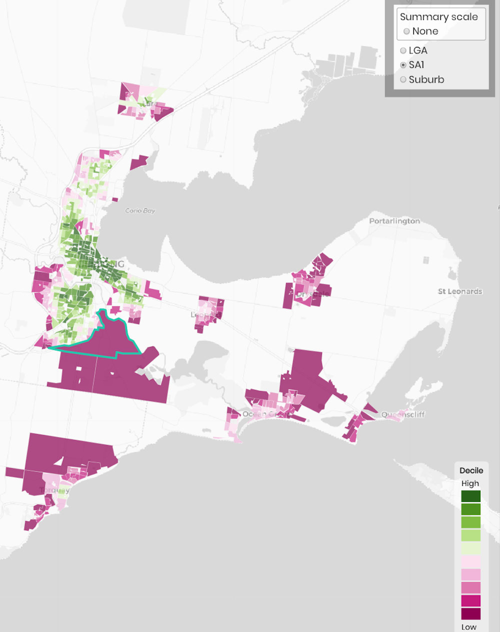
This is a common pattern in Australian cities. It is likely to get worse if city planning continues to allow sprawling low-density urban development that doesn’t deliver local services as new housing is built.
A closer look at social infrastructure
Our indicator of social infrastructure provides a good example of liveability differences within cities. This index measures residents’ access to 16 different types of essential community services within reasonable distances. Having to travel further than these distances has significant impacts on our health and well-being.
Social infrastructure describes the common services and facilities people need over their lifetimes. We have previously shown the growth areas of Melbourne lack these services despite their importance for health and well-being.
The chart below shows the overall Social Infrastructure Index for each regional city.
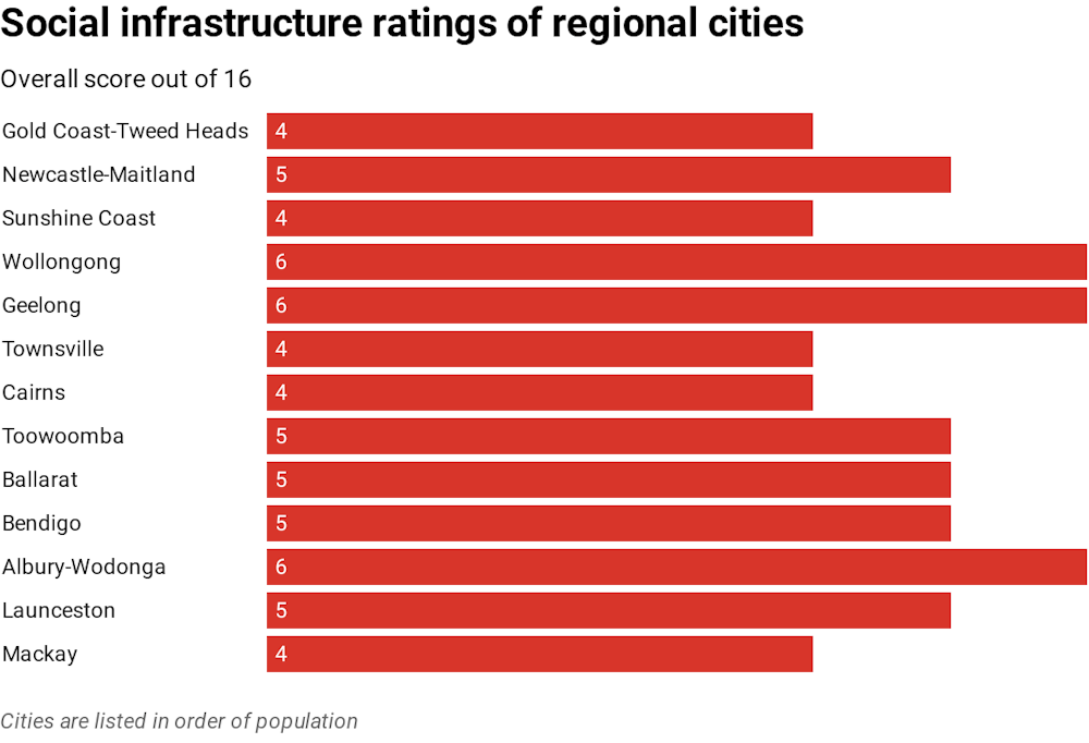
On average, residents of urban neighbourhoods in the 13 largest regional cities (6,245 neighbourhoods) have access to five of the 16 essential community services within recommended distances. The average for capital city neighbourhoods (33,722 neighbourhoods) is 6.5. Both capital cities and regional cities need better access to services.
Not surprisingly, Sydney and Melbourne have the best results. City-wide averages for these cities show residents have access to seven different types of services. Geelong, Albury-Wodonga and Wollongong perform as well as many capital cities and actually outperform Canberra, Darwin, Hobart and Perth on this measure.
Identifying priorities for local action
City-level averages and national comparisons are of limited use for improving liveability across Australian cities. We need to focus on within-city differences to drive action on inequities between neighbourhoods and to provide evidence to support more effective policy, planning and delivery.
For instance, the map below shows neighbourhood-level social infrastructure access across Albury-Wodonga. Access in central and established areas is very good, but poorer in outer areas. Liveability here is compromised as residents depend on cars to get to everyday services.
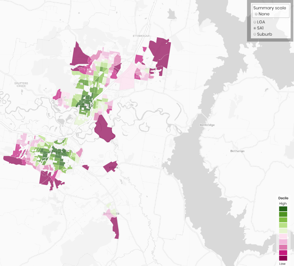
This pattern is becoming very common across our cities. It’s having long-term impacts on people’s health. This means ineffective city planning will have a long-term affect on health budgets across all levels of government.
Neighbourhood-level results presented in the Australian Urban Observatory clearly identify where policy and planning action should begin to reduce the inequities across our cities. These results show why we need to include regional cities in discussions about the future liveability and sustainability of our country.
We gratefully acknowledge the contributions of Rebecca Roberts, Katherine Murray and Fadhillah Norzahari to this article.
Indicator results for neighbourhoods and suburbs across the 21 largest cities are freely available in the Australian Urban Observatory. Liveability Report scorecards for each city are available here.![]()
Melanie Davern, Senior Research Fellow and Co-Director, Healthy Liveable Cities Group, Centre for Urban Research, RMIT University; Alan Both, Senior Research Fellow, Centre for Urban Research, RMIT University; Carl Higgs, Research Officer, Centre for Urban Research, RMIT University, and Lucy Gunn, Research Fellow, Healthy Liveable Cities Group, Centre for Urban Research, RMIT University, RMIT University
This article is republished from The Conversation under a Creative Commons license. Read the original article.
Jobs Just For You, The Planning Professional
Our weekly or daily email bulletins are guaranteed to contain only fresh employment opportunities